That time when Blue Ribbon Sports became Nike
Many visual brand identities are legacy – created for a specific moment in time.
Only a few stand the test of time. And that’s perfectly normal.
When a family business passes to a new generation, following a merger, or after a cultural shift, a once-popular name can suddenly feel out of touch. Modern buyers no longer connect with it, relevance slips, and often, sales follow.
Even established, successful businesses can try to “refresh perception,” but simply channeling the status quo rarely moves the dial.
After a settling-in phase, the new owner or Marketing Director learns the ropes and begins their own quest: how will I run this business and put my stamp on it? Then comes the moment of realisation – a phrase we hear time and again:
“We’re great, but we can’t compete anymore.”
“We’re dated. We need change.”
No one remembers the caterpillar, but most can tell you the name of their favourite butterfly.
From big commercial businesses to small independents, becoming irrelevant or out-of-date can mean the difference between success and failure.
That’s where we come in. Helping brands become meaningful, ownable, and relevant again. That’s where the journey begins.
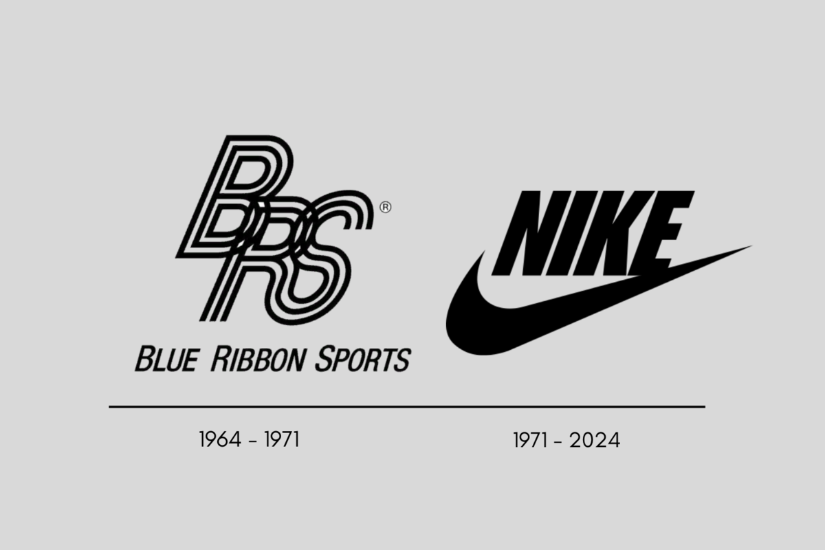
Take Phil Knight, co-founder of Nike. Blue Ribbon Sports and later Tiger Shoes, had run its course. With one bold stroke, Nike was born.
The now-iconic Swoosh, designed by Portland State University graphic design student Carolyn Davidson in 1971, cost $35 and a few shares in the newly formed company. Not bad going for a symbol recognised around the world today.
Why rebranding matters – lessons from the big names
Nike isn’t the only example. Every brand, from small independents to household names, faces the same challenge: relevance isn’t permanent.
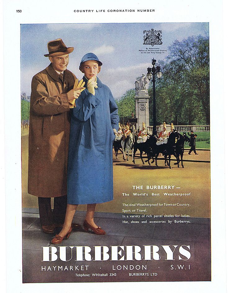
Take Burberry – a heritage brand that, for years, was synonymous with the trench coat and British luxury. By the early 2000s, it was tired and seen as staid. Through a bold visual overhaul, a sharper tone of voice, and renewed focus on lifestyle and culture, Burberry began to reconnect with a younger, global audience. And thats the key – connection. Something that often only an outsider can see and run with. Generally this is where I come in.
Even smaller brands can feel the pressure. A local business that’s been serving the same community for decades may find its look and messaging no longer resonate with new customers. A fresh identity, thoughtfully applied, can be the difference between standing still and standing out.
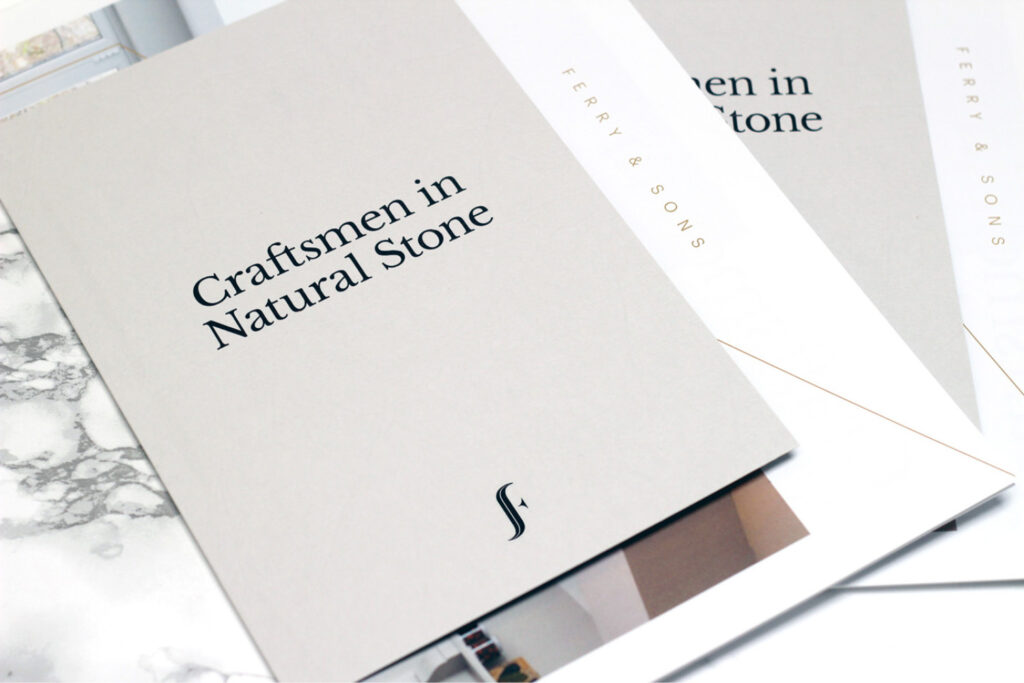
Here are some samples from a case study at Black & Ginger for local firm, Ferry & Sons – specialists in masonry and fine worktops. A legacy brand handed down from father to son(s), Mike knew that his vision was in the future and not in the past. Since launching the rebrand over 7 years ago, the business has never looked back and continue to grow, both in stature and client base.

How we approach rebranding
Rebranding isn’t about change for change’s sake – it’s about understanding what’s working, what’s not, and where the brand needs to be to connect with its audience tomorrow.
We start with:
-
Insight – listening to customers, stakeholders, and the market to uncover gaps and opportunities.
-
Positioning – defining what makes the brand ownable and distinctive.
-
Visual and verbal identity – ensuring the look, feel, and tone reflect the brand’s values and ambitions.
-
Activation – bringing the new identity to life consistently across all touchpoints, from digital presence to physical experience.
It’s a journey. One that balances heritage and history with ambition and relevance.
Done well, the result isn’t just a new logo or name — it’s a brand that feels alive, purposeful, and ready for the future.